Building the site : part three
Background and motion
I finally got around to making the page background look how I had imagined, replacing that sharp diagonal line with some animating waves at the half-way point of the page. I did wonder whether I should fix the background position independent of scroll position so that the wave is always visible at the midpoint of the viewport, but I decided against it as I think it serves as a subliminal indication of progress down the page. Plus it's something to look forward to as you scroll down. 😄
It wasn't actually anywhere near as complicated to create as I was expecting. Of course, I couldn't have done it without my old pal Google, but it turns out I'm not actually all that original and that the idea of animated wave SVGs is pretty popular and therefore pretty easy to learn how to implement without having to remaster trigonometric ratios and the dark mystic arts of the SVG path element.
First, I just wanted a static curved svg to see how easily I could fudge it into the background. For this, I found the beautifully relevant getwaves.io, which let me generate random wave patterns and copy the SVG path element which drew them.
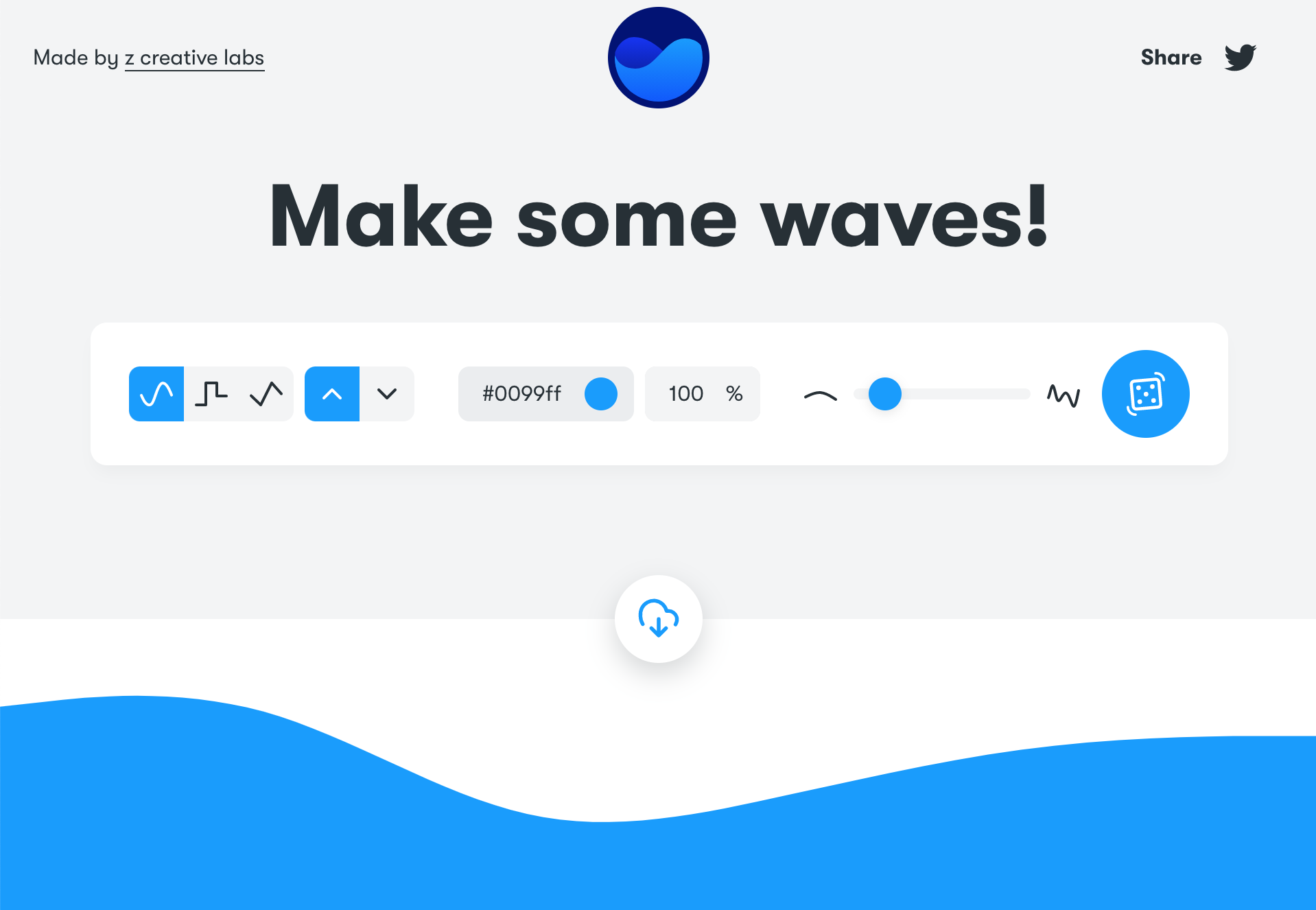
For reference, this is what the SVG code for a wave can look like:
<svg xmlns="http://www.w3.org/2000/svg" viewBox="0 0 1440 320">
  <path fill="#0099ff" fill-opacity="1"
        d="M0,96L48,90.7C96,85,192,75,288,101.3C384,128,480,192,576,213.3C672,235,768,213,864,192C960,171,1056,149,1152,138.7C1248,128,1344,128,1392,128L1440,128L1440,320L1392,320C1344,320,1248,320,1152,320C1056,320,960,320,864,320C768,320,672,320,576,320C480,320,384,320,288,320C192,320,96,320,48,320L0,320Z"></path>
</svg>
Good luck understanding what's going on in that <path d="..." /> attribute. I have a basic working knowledge of SVG drawing syntax, but there is no way I was making one of those on my own! Once I had generated one that I liked, I was able to save the .svg file and use that as the background-image to my site.
Of course, that looked pants since the wave was only around 320px tall and so it just plonked itself there at the top of my background and left the remainder of the page blank. What I wanted was the wave to form the transition from one background colour to another at the halfway point of the page. I could use CSS properties such as background-position and background-size to fine tune the placement, whilst the two-tone background could be achieved on a different element underneath the SVG background using a linear gradient with a sharp 50% horizontal split. However, the next problem was much more significant...
The SVG which I copied from getwaves.io was a fixed colour, and I needed it to match the second colour of my two-tone background to blend the transition. Changing SVG colours in CSS is pretty easy using the CSS stroke and fill properties, except you cannot expect it to work when the SVG is used as an image, either in an <img> element or as a CSS background-image — it just doesn't seem to be possible to address the SVG via CSS that way. The only way to allow CSS to influence an SVG in my experience is to use an HTML <svg> element in-line, instead of an .svg file as an image. I replicated the SVG code as a React component and used CSS to set the fill colour dynamically based on the random background colours being used.
The problem now was that the wave SVG was an inline-level element, and would become a part of the page layout rather than being a part of the background. I had a solution to that, but it felt (and still feels) a bit hacky: I created a new <Background> React component which would have two immediate children: (1) the SVG and (2) the actual content, and use CSS to layer them on top of another in the right places and put the two-tone solid background under the lot; something like this:
const Container = styled.div`
  position: relative;
  background: linear-gradient(...);
`;
const Svg = styled.svg`
  position: absolute;
  display: block;
  top: calc(50% - 160px); /* 160px = 1/2 SVG height */
  left: 0;
  z-index: 1;
`;
const Children = styled.div`
  position: relative;
  z-index: 2;
`
const Background = () => (
  <Container>
    <Svg />
    <Children>{children}</Children>
  </Container>
);
This worked great, although the CSS needed some tweaking from the above simplification in order to look correct on various screen widths.
Now that I had the curved line I wanted, the next challenge was to animate it in a way that made it look like a wave, slowly undulating up and down. I expected this to be a monster of a task, requiring me to look at the SVG paths of a number of waves to try to decipher and comprehend the immense gibberish which is the SVG path instructions in order to know what parts would change to achieve the desired effect. Once again, though, getwaves.io came to the rescue — indirectly this time.
When you click the "dice" button on this site to generate a new wave, the wave preview transitions from one wave to another. This tipped me off to the idea that browsers can perform the transition from one SVG path to another in the same way that they can transition, say, CSS position and colour. I did a quick Google to see how that was done and I was incredibly surprised at the answer. It was ridiculously simple, and completely unexpected.
It turns out, SVG paths can be described in CSS as well as in HTML. I still can't quite believe that this is correct, because on face value it doesn't make much sense, but in essence:
<svg viewBox="0 0 10 10">
  <path d="M2,2 L8,8" />
</svg>
...can also be achieved with:
<style>
  .drawMeWithCss {
    d: path('M2,2 L8,8');
  }
</style>
<svg viewBox="0 0 10 10">
  <path class="drawMeWithCss" />
</svg>
Even though I was convinced this was a bug-turned-feature, I wasn't going to complain because it meant that I now had an achievable way to animate an SVG path using native CSS animation:
@keyframes wave {
  0%   { d: path('<wave path 1>'); }
  100% { d: path('<wave path 2>'); }
}
.drawMeWithCss {
  animation: wave 30s ease-in-out infinite alternate;
}
It worked! I was pretty shocked at how straightforward that was, and definitely pleased with the result. Now that I had that working, I generated a bunch of new wave SVG paths and used those to give more animation keyframes to the wave, and to make it animate in a continuous forward direction, starting and ending on the same wave rather than bouncing back and forth since that looked less natural.
@keyframes wave {
  0%   { d: path('<wave path 1>'); }
  30%  { d: path('<wave path 2>'); }
  70%  { d: path('<wave path 3>'); }
  100% { d: path('<wave path 1>'); }
}
.drawMeWithCss {
  animation: wave 30s ease-in-out infinite;
}
The next thing I thought I could try was to add more <path> elements to the existing SVG and set slightly different opacities to each one, giving the visual appearance of numerous waves overlaying each other. By doing this and animating them all with slightly different timings, paths and keyframe offsets, I was able to achieve what I think looks like a nice natural "wave" aesthetic to transition the page background colours...
...but alas, my glee was short-lived. 😭
It turns out that the ability to use CSS to define and animate SVG paths only works in Chromium based browsers — it was a good thing that I checked and I suppose it demonstrates my lesson learned about publishing without testing on different browsers and devices.
I did some more checking and came across the SVG animate element, which can be used as a child of an SVG shape element to define multiple values to animate between. It looked like it supported the same animation properties that I had used in CSS, and so I refactored my SVG to use that element inside each of the path elements instead:
<svg>
  <path>
    <animate
      attributeName="d"
      values="<wave path 1>;<wave path 2>;<wave path 3>;<wave path 1>;"
      keyTimes="0;0.3;0.7;1"
      dur="30s"
      calcMode="splines"
      keySplines="0.42 0 0.58 1;0.42 0 0.58 1;0.42 0 0.58 1"
    />
  </path>
  ...
</svg>
The calcMode and keySplines here represent a cubic bezier timing function similar to the CSS animation ease-in-out function. I fired that up in numerous browsers and devices and thankfully it seemed to work everywhere. Phew!
The finishing touch for this was to acknowledge that not everybody wants motion in their site, and so using the relatively modern CSS media feature @media (prefers-reduced-motion) to turn off the animation when that preference is set. Whilst this would have been easy if the animation was done in CSS like it was initially, this proved to be less obvious for the SVG animate element approach since there seemed to be no way to control that animation from CSS. The solution I settled for in the end was to add duplicate paths, one with and one without animation, and use CSS to determine which of these to display based on whether reduced motion was preferred.
My ambition from the last update was to "Focus on the page backgrounds and try to make them purr", and whilst it's probably quite subjective whether there is any "purring" going on there, I'm pretty happy with the result and it matches the vision I had. As always though, there's room for improvement so this might not be the end of the work on the background.
Bonus motion
Another friend of mine made a great suggestion that I could have the hand icon on my homepage do a little wave, and since I was looking for an opportunity to introduce subtle motion to the landing page, I had a go at implementing it. Thanks for the idea, Tiff!
This was a much simpler animation task than the waves in the background, as I could use native CSS animation properties to make the hand rotate back and forth a few times, a short while after the page had loaded.
Right now, the animation is slightly crude and looks a bit unnatural; it might be something I'd look to improve in the future to make the waving animation look more authentic, although I suspect that might require having a more dynamic SVG to make the palm and fingers a little less rigid... one for me to consider if I ever decide to get ultra-creative with SVG animation, which to be fair I would like to do at some point.
Proper 404s
I mentioned in my last update that I had found a way to prevent unwanted 404 errors from occurring when deep-linking to a route on the site, and that the solution to that actually meant that nothing was ever a 404.
My two thoughts at the time on how to fix that were (a) generate a dynamic _redirects file based on the actual pages of the site, and (b) kick the CRA SPA into touch and migrate to a static site generator. I opted for approach (a) as a short term solution because I want to look at the migration once I have built up enough of the site to have complex and interactive pages to migrate, to learn how those would be done.
Creating the _redirects file dynamically wasn't too complicated. I already had a code-based representation of my site map as a file which I used to help with the navigational components of the site. All I needed to do was to write a script to create a new _redirects file which included all of the site pages as instructions to redirect to index.html 200, with a catch-all at the bottom to 404 everything else. The final output would look something like this:
/ /index.html 200
/site-build-001 /index.html 200
/site-build-002 /index.html 200
/site-build-003 /index.html 200
/* /index.html 404
The reason that the 404 rule also redirects to the /index.html file is so that the routing for my 404 page can be handled by the router for the site.
All I needed to do now was to ensure that this file was generated every time that the site was deployed, which could be achieved by making it a part of the build process — to happen after the build had completed — and to place the file into the build folder to be published. Doing this in an npm based project is easy - I just added a postbuild script to package.json which ran the script to generate the file.
Testing
Some of the other things that I said I would look into last time revolve around testing - both device and browser testing as well as unit testing. I'm going to make them the primary focus of my next update, because this one is probably already a bit too long and I want to start afresh with my documentation on the testing approach. I've got a few ideas and have been pointed to a few tools, so the next update will give them a spin.
Next steps
I think that's enough for this update, time to publish. Next steps would be:
- Testing.
- Testing.
- A bit more testing.
I hope to get a test approach defined and make automated testing a part of my build & publish process. I'll also look into manual browser testing and visual regression testing tools to see what I can benefit from.